

Seeing yourself
in fashion.
← All cases
SHE SHAPES · FASHION
A brand for different proportions. Imagery that makes that commitment visible. Digital models for She Shapes.
She Shapes × DIGITALMUSE · AI-generated models · Image from the brand's archived website.
CLIENT
She Shapes
OUR CONTRIBUTION
Hyperrealistic AI visuals
VISUAL WORLD
Digital models & fashion
01 / THE STORY
That feeling: this could be me.
Before trying on a piece of clothing, we imagine ourselves wearing it. How the fabric falls. How we would move in it. Whether we would feel comfortable. A fashion image can spark that thought when we recognise something of ourselves in it.
She Shapes caters to women with fuller busts, accounting for bust and waist separately in its sizing system. The challenge was to reflect different proportions in the imagery, too. According to the brand, finding suitable real models to represent that range was difficult for the young business.
02 / THE BRIEF
A commitment needs
the right images.
The visual task connects two things: showing clothing and helping people imagine how they might feel wearing it. Different body proportions are part of the brand's identity.
The seated image makes that connection tangible. The top's ruching, the position of the arms and the line of the trousers remain visible. The leather armchair and quiet natural tones bring warmth to the scene. The outfit belongs in a lived-in space, close to a situation we can imagine ourselves in.
Ruching, the drape of the fabric and a relaxed pose place the clothing in an everyday context.
THE CREATIVE IDEA
Fashion imagery where differences naturally belong.
03 / OUR WORK
Digital models.
Rooted in real proportions.
She Shapes works with DIGITALMUSE on its hyperrealistic AI visuals. According to the brand, the digital models are based on real body measurements from its sizing system. Their appearances do not reproduce specific individuals. Skin texture, creases and asymmetry are part of the approach it describes.
The selection combines a group image with individual portraits. The shared image offers a view of the brand as a whole. The individual views leave more room for clothing, posture and detail. Warm browns, black and white connect the sequence as perspectives and styling change.
04 / THE VISUAL LANGUAGE
From a shared presence
to an individual detail.
The white blouse creates a clear contrast with the dark armchair and loosely draped blazer. Collar, buttons and folds guide the eye towards the garment. The relaxed seated pose gives the image an effortless presence.
Together with the group image and beige top, it creates a small visual narrative: different looks, the same calm atmosphere. Each image adds another perspective on the collection.
05 / RESULTS & USE
← Back to all cases
A clear contrast between white and black. Clothing and posture carry the image.
A visible visual world.
An open approach to AI.
The three selected images come from the brand's archived website. She Shapes explains its use of digital models on a dedicated transparency page and names DIGITALMUSE as its partner.
The brand describes AI as a conscious choice for its current situation while also announcing future productions with real women. That openness is part of the project's story.
Back to top ↑


This is what
home could feel like.
← All cases
INTERLIVING · INTERIORS
Bedrooms and rugs. Interior imagery that creates atmosphere while keeping the product in focus.
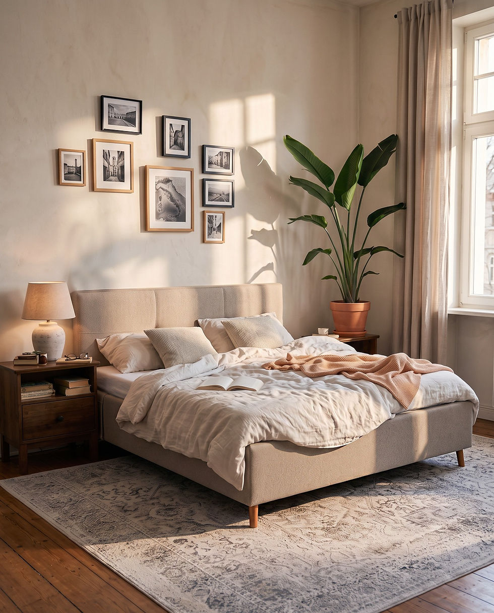
A bed and wardrobe in a bright period interior.
BRAND
Interliving
OUR CONTRIBUTION
AI visuals for bedrooms & rugs
VISUAL WORLD
Interiors
01 / THE STORY
From furniture to a feeling of home.
Sometimes the idea of your own home begins with a single detail: light on an upholstered bed. The texture of a rug. A room where everything belongs together. A piece of furniture becomes an idea of how you would like to live.
Interliving sees itself as a partner for furnishing the whole home, with coordinated collections and personal advice. Our bedroom and rug imagery builds on that approach: products should remain recognisable while creating an atmosphere people can imagine themselves in. The room gives the furniture meaning; a closer look reveals its character.
02 / THE BRIEF
Show the products.
Make the rooms feel real.
The collaboration within the Einrichtungspartnerring / VME network covered bedroom furniture and rugs. A bed and wardrobe needed to appear together in a coherent setting. The rugs were integrated into interiors without models.
Both product groups were to be shown in believable living spaces. The bedroom required classic perspectives for print and more contemporary views for social media and the Wohnbuch catalogue. Product references, materials and proportions all had to be taken into account.
The rug in its relationship with furniture and space.
THE CREATIVE IDEA
A room sparks the imagination. The detail makes it tangible.
03 / OUR WORK
From the whole room
to the finest texture.
The bedroom image presents the bed in a bright period interior. The rug images move between room views and material detail: the wide shot shows the relationship with the furniture, while the close-up reveals the texture. During refinement, the product focus and fine rug structure were further defined.
04 / THE VISUAL LANGUAGE
The feeling of a room.
The texture of a material.
The bedroom image gives the bed and wardrobe a shared spatial context. Light and architecture make the furniture feel part of a lived-in room.
With the rugs, the scale changes. The room view shows how the product connects the furnishings; the detail brings its texture into focus.
05 / RESULTS & USE
← Back to all cases
A close-up of the rug texture.
The visual world
as a whole.
The collaboration comprises two completed productions: bedroom imagery and rug images. The selection combines room views with product details. For the bedroom, we developed classic perspectives for print and more contemporary views for social media and the Wohnbuch catalogue.
Back to top ↑


A room that
feels like you.
← All cases
ROOMIO · INTERIORS
Sofas between a sense of space and a closer view of materials. Imagery that leaves room for your own style.
The sofa at the centre of a living space.
BRAND
Roomio
OUR CONTRIBUTION
AI visuals & product staging
VISUAL WORLD
Interiors
01 / THE STORY
Somewhere you want to stay.
A sofa you want to sit on a little longer. A fabric you can almost feel through the screen. A room that leaves space for your own style instead of prescribing it. This is where Roomio's story begins.
The brand connects individuality with comfort and clear, contemporary forms. Its outlook is open: people should be able to shape their homes around their own ideas. For the imagery, that means offering different ways a home can feel. Light, textiles and surroundings create possibilities that different people can see themselves in.
02 / THE BRIEF
Comfort needs
a place to belong.
Roomio brings together individual style, modern furniture and comfort. Its digital presence should show how a piece of furniture can fit into someone's life. Our shared pilot focused on sofas in different living environments.
The pilot needed to connect the atmosphere of a room with a closer view of the product. The images had to offer inspiration for furnishing a home while showing the upholstery and materials.
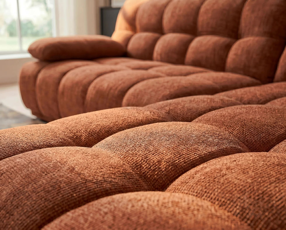
Another setting with a feeling of its own.
THE CREATIVE IDEA
Show a piece of furniture – and the possibility of making it your own.
03 / OUR WORK
Light, fabric and space
tell the story together.
The sequence moves from the whole room to the detail. Soft light, complementary furniture and a close view of materials give the sofa context. The different settings are individual compositions, not a single continuous room.
04 / THE VISUAL LANGUAGE
One sofa.
Different ways to feel at home.
The surroundings change how a sofa is perceived. Light, accompanying furniture and textiles give each setting its own character.
Moving between the room and product detail connects both perspectives: the idea of living there and a closer view of upholstery and material.
05 / RESULTS & USE
← Back to all cases
Product and material details complement the room views.
The visual world
as a whole.
We show three images from the approved pilot. They connect different living environments with a closer look at the sofa. The images give the furniture spatial context while keeping its form and material qualities visible.
Back to top ↑

Home remains
home.
← All cases
RAUMSCHMIEDE · INTERIORS
A visual world for Henriette Komfort: familiar comfort, human connection and support in everyday life.
Henriette Komfort in a welcoming bedroom setting.
BRAND
Raumschmiede
OUR CONTRIBUTION
Model & scene development
VISUAL WORLD
Interiors
01 / THE STORY
The familiar place remains.
Our bedroom is a familiar place. The day begins here, and we return here to rest in the evening. When our needs change, that feeling should remain – even when a bed needs to offer more support.
Betten.de, a Raumschmiede shop, places personal advice and each customer's circumstances at the heart of its approach. For the Henriette comfort bed with nursing-bed functionality, this creates a particular visual challenge: how can we show everyday support without reducing a person to their need for it? A welcoming room, familiar faces and small everyday gestures are the starting point of this story.
02 / THE BRIEF
Show the support.
See the person.
The imagery for the Henriette Komfort upholstered bed needed to connect a homely character with nursing-bed functionality. Independence, enjoyment and closeness were central. People and the room needed to remain recognisable across scenes.
The images were to communicate everyday situations and the bed's functions. Their relationship was essential: the support provided by the bed remains visible, while the space feels like a home and the people appear as individuals with lives of their own.
Closeness and connection by the bed.
THE CREATIVE IDEA
The function belongs to the bed. The home belongs to the person.
03 / OUR WORK
Connecting everyday life,
closeness and function.
Working from the client's brief, DIGITALMUSE developed model and scene variations. These include a calm room view, moments of connection by the bed and a depiction of its lift function. Natural appearance, the headboard's quilting and a consistent room arrangement shaped the work on the images.
04 / THE VISUAL LANGUAGE
One room.
A part of everyday life.
The calm room view first presents the bed as part of a home. Moments of connection by the bed continue the story: people live their daily lives and relationships here.
The technical function is embedded in this context. The room remains recognisable even as the situation and perspective change.
05 / RESULTS & USE
← Back to all cases
Room and bed as parts of one coherent visual world.
The visual world
as a whole.
The imagery brings together the room, human connection and the bed's function. The selected images offer an insight into the visual development for Henriette Komfort. At its heart is a familiar home where support has a natural place.
Back to top ↑


Skincare begins
with a feeling.
← All cases
DR. GRANDEL × HAPTIK · BEAUTY
How can skincare be seen before it is felt? For SKN Essentials, we translate products and textures into a sensory visual world in collaboration with the agency Haptik.
Barrier Cream: light and fine grooves make the cream texture the opening to the visual world.
BRAND & PARTNER
DR. GRANDEL · Haptik
OUR CONTRIBUTION
Art direction · AI product visuals
IN FOCUS
Product · Material · Light
01 / THE STORY
Connection begins before the first touch.
A drop on a smooth surface. Light passing through a liquid. A cream whose consistency you can almost feel. Before trying a skincare product, we already have an image of it. We wanted to shape that first sensory impression for SKN Essentials.
DR. GRANDEL develops and produces cosmetics in its own laboratories and production facilities. This commitment to precision informs our visual language: the product stays clear and recognisable. Around it, a world of material, colour and light invites a closer look.
02 / THE BRIEF
Show a product. Convey a feeling.
Our task within the agency project was to develop product imagery without models and present different skincare products as a coherent series. The packaging needed to retain a clear presence while the setting gave each image its own character.
DIGITALMUSE contributed art direction and AI-assisted visual production. The collaboration was through Haptik, Jay Da Costa's agency. Our focus was on developing and refining the product and material worlds.
SKN Essentials together: Niacinamide Glow Serum, Hyaluron Serum and Slow Aging.
THE CREATIVE IDEA
A texture can convey a feeling before we touch it.
03 / OUR WORK
From material to visual idea.
We tell the story of the products through their relationship with their surroundings. A pale liquid creates a different impression from a dense cream texture. Red elements provide a deliberate contrast with the restrained packaging. Colour and material distinguish the images without breaking the series apart.
The creative work lies in that relationship: how much space does the product need? Where does a reflection lead the eye? When does a texture support the bottle, and when does it compete with it? The selection keeps product contours clear and gives the material a carefully considered role.
04 / THE VISUAL LANGUAGE
Three images. A recognisable approach.
The shared product series makes the connection visible. Fresh yellow accents, a pale flowing setting and red details create three distinct moods. A precise product presence connects them.
Textures are part of the composition: they translate the sensory idea of skincare into images. Clear contours and carefully placed highlights connect emotional closeness with precise product presentation.
05 / RESULTS & USE
← Back to all cases
Slow Aging: product and red design elements.
A visual repertoire for the brand.
The product images make different material worlds read as a series. They can work individually as focal points or together. The documented collaboration included moving images and format adaptations alongside still imagery; the selection here focuses on the available images.
Brand: DR. GRANDEL ↗
Partner agency: Haptik ↗
Art direction & AI visuals: DIGITALMUSE
Back to top ↑


The day begins
with you.
← All cases
INJOOI / AZBA · BEAUTY
A new skincare brand finds its visual language: personal moments, clearly presented products and a rhythm of its own.
A product image from the injooi visual world.
BRAND
Injooi / azba
OUR CONTRIBUTION
Brand visuals, product imagery & film
VISUAL WORLD
Beauty
01 / THE STORY
A small moment for yourself.
A breath in the morning before the day begins. A moment in the evening when everything becomes quieter again. Skincare belongs to these small transitions – a routine that can feel deeply personal.
Berlin-based injooi builds its skincare world around the rhythm of day and night. Behind the brand is azba cosmetics. Establishing this new brand called for more than a collection of individual product shots: it needed a recognisable feeling. Our shared pilot was the first step towards finding that language in images, combining natural moments with a clear product presence.
02 / THE BRIEF
Build a brand.
Make a feeling recognisable.
azba cosmetics was developing its own brand, injooi, and looking for natural-looking images and video. We began with a small selection of website visuals to establish a shared visual language. The brand connects skincare with the rhythm of day and night.
The pilot was intended to give a first impression of the new brand identity. People, products and light needed to work together. Cut-out product images for the launch later complemented this work with a clear presentation of the range.
A clear product presence shaped by light.
THE CREATIVE IDEA
Skincare is a product. And a moment in your day.
03 / OUR WORK
Human connection.
Product clarity.
Human moments make the brand feel approachable; clear product views help people find their way through the range. The two complement each other: a feeling for the brand and a clear view of its products.
04 / THE VISUAL LANGUAGE
Clear in the product.
Personal in the feeling.
The product images bring consistency to the range. Light and setting give each image atmosphere while keeping the products clearly recognisable.
Moving images add rhythm over time to these still views. Together, the two forms can support different moments within the brand experience.
05 / RESULTS & USE
← Back to all cases
Another perspective on the range.
The visual world
as a whole.
The shared pilot established a visual language for the new brand, followed by cut-out product images for the launch. The selection shown combines product imagery with film and reveals both sides of the brand experience: clarity within the range and a personal feeling for the brand.
Back to top ↑


The product range as a coherent visual world.
An individual image from the product selection.

Small forms.
A personal subject.
← All cases
ASLAN · PRODUCT
Product animations with transparent backgrounds that reveal form and material as part of the digital brand experience.
A still from an ASLAN animation: Bubbles.
BRAND
ASLAN
OUR CONTRIBUTION
Product videos & alpha animations
VISUAL WORLD
Product
01 / THE STORY
A closer look at the small things.
Caring for our wellbeing often begins with small habits. When shopping online, we first encounter packaging, a capsule, a name. A closer look can turn an abstract product into something easier to understand.
ASLAN places vitality and quality of life at different stages of life at the centre of its brand identity, drawing on Ana Aslan. Our visual contribution focuses on the products themselves: form, surface and movement. The animations give small objects space and attention without depicting medical effects.
02 / THE BRIEF
Products in motion.
Without a distracting background.
ASLAN needed product videos and capsule animations for its new website. The products differ in shape, surface and packaging – qualities a static image can only show from one perspective.
The brief was to develop product videos and capsule animations that reveal these individual forms and surfaces and integrate naturally into the website.
A still from another animation: Carrier.
THE CREATIVE IDEA
Movement turns a single view into a closer look.
03 / OUR WORK
Three forms.
Three ways to move.
The three loops deliberately show different subjects: a glossy orange capsule, a product stick and a transparent capsule filled with granules. Still images of other subjects provide a quieter counterpoint. Transparent backgrounds allow the website's own surface to show through, bringing form and material to the foreground.
05 / RESULTS & USE
← Back to all cases
Herzplus as an additional still from the animation work.
The visual world
as a whole.
Product videos and capsule animations were created for the new website. The three loops shown have transparent backgrounds and can sit directly on the website's own surface. Additional stills from the animations provide a calm counterpoint to the moving forms.
Back to top ↑


Daylight · Capsule
Testosamin · Stick
Neurobalance · Granule capsule


A familiar moment.
A fresh perspective.
← All cases
ZAPA · PRODUCT
Moving website assets for an oral-care brand. A visual opening that works on desktop and smartphone.
A still from the desktop header video.
BRAND
ZAPA
OUR CONTRIBUTION
Website assets & animation
VISUAL WORLD
Product
01 / THE STORY
A moment of attention in everyday life.
For many people, brushing their teeth is such an ordinary part of the day that they barely think about it. For a brand seeking to tell a new story about oral care, that is the communication challenge: creating a moment of attention within a familiar routine.
ZAPA places oral care within a broader health context. The website is where people first encounter this idea. DIGITALMUSE contributed visual assets and animations. Movement gives the opening its own rhythm; different formats carry the imagery across desktop and smartphone.
02 / THE BRIEF
A first impression
in motion.
ZAPA positions oral care within a personalised, data-oriented brand context. Visual assets, a header video and animations were produced for its website.
The moving introduction needed to work on desktop and mobile. Different image formats require their own framing and a clear visual focus so the imagery remains understandable on both devices.
The vertical version for the mobile website opening.
THE CREATIVE IDEA
A short moving introduction can offer a fresh perspective on a familiar routine.
03 / OUR WORK
One visual world.
Several screen formats.
The production connects a moving website header with supporting assets and animations. Desktop and mobile versions present the imagery in different formats. DIGITALMUSE contributed these visual elements to the website.
05 / RESULTS & USE
← Back to all cases
The visual world
as a whole.
The production comprises website assets, moving header imagery and animations. Separate desktop and mobile versions adapt the imagery to different screen formats. DIGITALMUSE's contribution is the visual production for the website.
Back to top ↑


Hands tell the stories of our lives.
← All cases
EUTERPFLEGE · SKINCARE
Cream, hands and small everyday moments. A visual world for EUTERPFLEGE that brings product and touch together.
Hands holding EUTERPFLEGE Care + Repair Gold cream against a purple background.
BRAND
EUTERPFLEGE
OUR CONTRIBUTION
Product imagery & everyday scenes
SELECTION
Image series & short product film
01 / THE STORY
Hands tell the stories of our lives.
They grip handlebars, carry bags, hold us close and turn small gestures into connection. Skincare belongs in the middle of this everyday life. Sometimes it begins with a brief moment: opening a tube, placing some cream on a hand, bringing the hands together.
For EUTERPFLEGE, this familiar moment is the starting point of the visual story. Hands, skin and contact with the product take centre stage. The cream appears as something that accompanies us: at home, on the go and between the things we already do.
02 / CONTEXT & BRIEF
Show care where it happens.
The EUTERPFLEGE briefs describe an approachable visual world with visible skin texture, natural movement and unusual perspectives. Care + Repair was to appear in everyday situations where the product has a natural place.
The task for the selected series was to connect a close view of the product with everyday familiarity. Packaging needed to remain recognisable, while hands, movement and surroundings gave the images their own character.
A woman with two Care + Repair creams against a yellow background.
THE CREATIVE IDEA
Care begins with a touch. The images stay close to that moment.
03 / OUR WORK & EXECUTION
From a product image to a small story.
The selection combines four images with a short Care + Repair Gold film. The hand image brings us close to the tube. The duo portrait presents the products with a person. The wing mirror and skateboard take the imagery into situations beyond the bathroom.
Purple and yellow echo the colour accents described in the brief. Black and white packaging surfaces hold the product family together. Alternating clear product compositions with everyday scenes creates variety without losing sight of the brand.
04 / THE FILM
Skincare becomes a gesture.
The film, just under nine seconds long, focuses on a simple sequence: hands hold the tube, cream is dispensed and spread on the skin. At the end, the product stands on its own again.
Close-ups give texture and touch room. The purple background connects the scenes and links the film to the still image of the hands. The portrait format makes small movements feel significant.
05 / RESULTS & USE
← Back to all cases
EUTERPFLEGE on the go: a woman and cream tube in the wing mirror of a yellow car.
A visual world that creates connection.
Four selected images and a portrait-format film bring together different perspectives on EUTERPFLEGE. Together, they tell a story of product, application and everyday life, using recurring colours and staying close to hands and skin.
The image and film elements form a coherent series: the product remains recognisable while perspective and situation change. A single tube becomes a story about small moments of care in everyday life.
Back to top ↑


Care + Repair cream on a skateboard.

A summer that stays with you.
← All cases
HAKA · SUMMER SERIES
Salt on the skin. Sand in the fabric. A yellow bikini that tells the story of a day at the beach – and of caring for the things we love.
Sun, skin and natural movement: an image from the AI-generated HAKA summer series.
BRAND
HAKA
OUR CONTRIBUTION
AI-generated imagery and film
FORMAT
Summer film & still imagery
01 / THE STORY
What stays with us after a beach day.
Eyes closed, sun on your face, one more dip in the water. These are the little moments when summer feels effortless. The yellow bikini is more than something to wear: it accompanies the day, from the first jump into the sea to the sand still caught in its fabric afterwards.
This is where the HAKA story begins. Sand, salt and sunscreen are part of a day at the beach. Washing becomes a continuation of that story: caring for favourite pieces so they can come with us next summer, too.
02 / THE BRIEF
A summer feeling meets
a practical application.
HAKA wanted a short storytelling film about washing a bikini, intended for its online shop and Meta ads. The imagery was to feel high-quality, lively and approachable.
The brief connected beach moments with two uses: washing with HAKA neutral soap while away and with delicate laundry detergent at home. A yellow bikini runs through the story as a recurring motif.
Wind in her hair, the sea behind her: movement connects the model and the setting.
THE CREATIVE IDEA
First, make summer feel real. Then show how we care for the things that come with us.
03 / OUR WORK
Connection begins
in the details.
DIGITALMUSE translated the brief into an AI-generated summer visual world and accompanying film. Water on skin, light on wet fabric and movement on the beach give the story its rhythm. The yellow bikini visually connects the changing scenes.
The imagery follows the brief's balance of everyday familiarity and considered composition: natural skin texture, hair in motion and small details of a beach day. Close-ups create intimacy; scenes of use bring that feeling back to the product.
04 / THE FILM
From the sea
to caring for what we wear.
The approximately 30-second film tells the summer story as a connected sequence. Beach, fabric and skin form the opening; washing the bikini leads into the practical application.
The two accompanying landscape images echo the film's light and movement. The visual language remains recognisable in a single image.
05 / RESULTS & USE
← Back to all cases
HAKA summer film · 30 seconds · Vertical format · With sound. Click to play.
A feeling.
A story that makes sense.
The result is a summer film and accompanying images that bring lifestyle and product use together. The available film is in vertical 9:16 format; the two images shown here complement it in landscape format.
The client brief specified the HAKA online shop and Meta ads as intended channels. This case presents the creative execution: an everyday product story that begins with a familiar summer moment.
Back to top ↑


When nature becomes a feeling.
← All cases
NATURE & SKIN · BEAUTY
Light on a leaf. A hand on skin. An evening that belongs to you alone. Three distinct visual worlds make natural skincare feel tangible, connected by intimacy, calm and attention to detail.
Nature, touch and an evening ritual: distinct moods with a shared visual language.
INDUSTRY
Premium natural skincare
OUR CONTRIBUTION
AI visuals & cinematic imagery
FORMATS
Campaign imagery · Macro photography · Website films · Social adaptations
01 / THE STORY
Skincare begins with a feeling.
Before we feel a texture on our skin, we imagine it. Is it light? Gentle? A small moment of calm? This is where the work begins. Plants, light, skin and movement tell a story of care without relying on packaging to explain it.
The visual worlds deliberately have different temperaments: the freshness of nature, the immediacy of touch and the quiet atmosphere of evening. Each stands on its own. Together, they create a journey from origin to experience to personal ritual.
02 · THE BRIEF
One approach. Several stories.
Natural skincare needs more than one beautiful image. The challenge is to connect different themes and channels without making every new format feel like a different brand. An open landscape tells a story differently from a movement of the hand. A website film has a different frame from a vertical social video.
Our work connects these differences through light, colour and gentle movement. Each visual world retains its own identity; a recurring closeness to skin, plants and textures holds them together.
A story does not simply get smaller.
The two films belong together: they show how one visual world is adapted for a website and social media. In landscape format, the sense of space carries part of the story. In portrait format, leaf, skin and light move closer to the viewer. What matters is what remains visible in each frame and where a movement leads.
That is why the versions appear side by side here. They are not two different campaigns, but two responses to different viewing habits. The atmosphere remains recognisable; the frame changes its effect.
THE CREATIVE IDEA
Nature moves us when we can see ourselves in it.
03 · OUR WORK
VISUAL WORLD 01 · NATURE
From natural origins to the feeling on skin.
Sunlight moves across a leaf. A plant's structure becomes a miniature landscape. The soft surface of a cream continues that movement. The story moves from nature to skincare through visual connections, rather than a series of unrelated product images.
Green, warm light and pale textures define this visual world. Wide views alternate with macro detail: the setting creates atmosphere, while the details make its sensory qualities tangible.
VISUAL WORLD 03 · EVENING RITUAL
When the day grows quiet.
Violet flowers, soft evening light and the moon set a different tone. The freshness of daytime gives way to a calmer, almost dreamlike atmosphere. Skincare becomes time for yourself – a transition from the outside world to a personal moment.
This world deliberately has its own section. It does not have to compete with the sunlit close-ups. Its colours and rhythm create a new emotional space; its closeness to nature and skin connects it to the other work.
← Back to all cases
Two scales, one idea: plant structure and cream texture connect natural origins with the feeling of skincare.
A visual system with room to develop.
The individual images and film sequences form a coherent visual repertoire: nature as origin, touch as experience and the mood of evening as ritual. Their differences make the selection versatile. A shared approach holds it together.
Landscape and portrait versions show how an idea can be adapted for a website and social media. Macros and individual images add their own accents. Close-ups create greater intimacy and can deepen a story instead of simply showing the same film again.
The value lies in this connection: distinct visual worlds, clearly assigned formats and material that can be brought together to tell different stories.
Back to top ↑


VISUAL WORLD 02 · TOUCH
How close can an image come?
Cream is spread on the back of a hand. Fingers glide over a shoulder. A face rests against its own skin. The wider story of nature becomes small and personal: the gesture, rather than the setting, carries the moment.
The close-ups do not need an elaborate plot. Skin texture, slow movement and shifting light give them depth. They add the physical experience of skincare to the atmospheric films: applying, feeling, pausing for a moment.
WEBSITE · LANDSCAPE
The wide frame gives landscape, light and movement room to breathe. Nature can become a setting; the film leaves space to immerse yourself.
WEBSITE · EVENING WORLD
The landscape and sky carry the mood. The landscape format opens up the space around the person, allowing the evening to be felt as a whole.
SOCIAL MEDIA · EVENING WORLD
The portrait format concentrates the same atmosphere. Person, flowers and moon are given a different visual balance within the narrower frame.
THREE CLOSE-UPS · ONE SEQUENCE
The back of a hand, a shoulder and a moment of resting skin contact form a short sequence. Moving from detail to person opens up the story without losing its intimacy. These scenes can draw attention to a gesture individually or connect a longer narrative as building blocks.
SOCIAL MEDIA · PORTRAIT
The same visual world in a vertical format. The tighter frame draws greater attention to individual details and movements.


04 · RESULTS & USE